pacman::p_load(sf, spdep, tmap, tidyverse)Hands-on Exercise 2 part 2
Global Measures of Spatial Autocorrelation
Overview
In this exercise we will utilise Global and Local Measure of Spatial Autocrrelation(GLSA). We will plot a Moran scatterplot and compute and plot the spatial correlogram. Additionally we will also compute the Local Indicator of Spatial Association(LISA)
Loading packages and data
Load packages
Load data
Here we will use the local development indicators of Hunan province, China, in 2012.
hunan <- st_read(dsn = "data/part 2/geospatial",
                 layer = "Hunan")
Reading layer `Hunan' from data source
`C:\Users\Lian Khye\Desktop\MITB\Geospatial\geartooth\ISSS624\Hands-on_Ex02\data\part 2\geospatial'
using driver `ESRI Shapefile'
Simple feature collection with 88 features and 7 fields
Geometry type: POLYGON
Dimension: XY
Bounding box: xmin: 108.7831 ymin: 24.6342 xmax: 114.2544 ymax: 30.12812
Geodetic CRS: WGS 84hunan2012 <- read_csv("data/part 2/aspatial/Hunan_2012.csv")Rows: 88 Columns: 29
── Column specification ────────────────────────────────────────────────────────
Delimiter: ","
chr (2): County, City
dbl (27): avg_wage, deposite, FAI, Gov_Rev, Gov_Exp, GDP, GDPPC, GIO, Loan, ...
ℹ Use `spec()` to retrieve the full column specification for this data.
ℹ Specify the column types or set `show_col_types = FALSE` to quiet this message.Relational join of data
Here we will join the hunan2012 dataframe to the polygon or the hunan map. Bascially relating the development data to various regions of Hunan.
hunan <- left_join(hunan,hunan2012) %>%
  select(1:4, 7, 15)
Joining with `by = join_by(County)`equal <- tm_shape(hunan) +
tm_fill("GDPPC",
n = 5,
style = "equal") +
tm_borders(alpha = 0.5) +
tm_layout(main.title = "Equal interval classification")
quantile <- tm_shape(hunan) +
tm_fill("GDPPC",
n = 5,
style = "quantile") +
tm_borders(alpha = 0.5) +
tm_layout(main.title = "Equal quantile classification")
tmap_arrange(equal,
quantile,
asp=1,
ncol=2)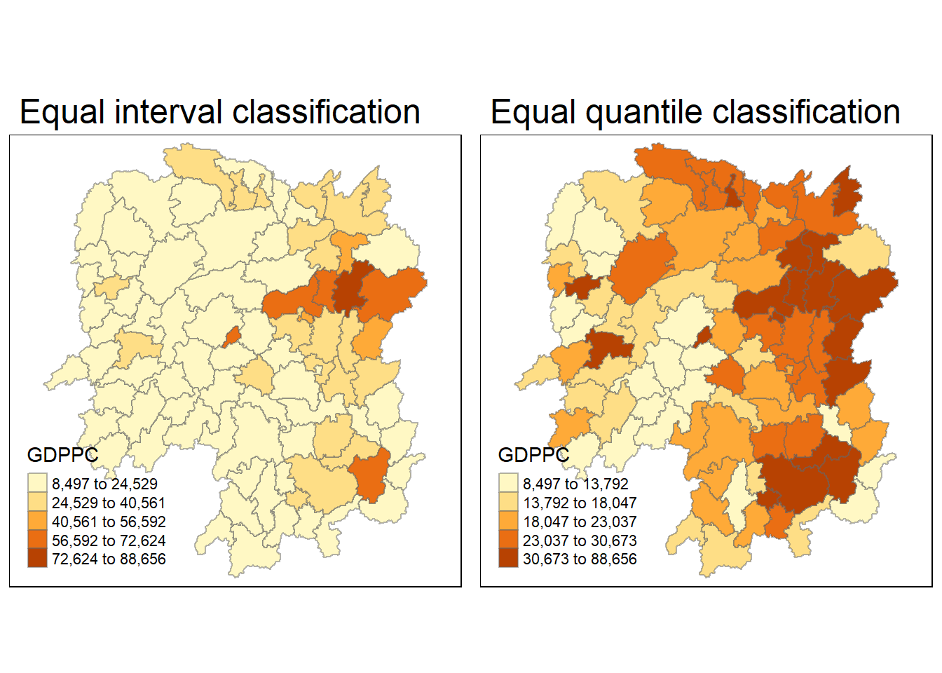
Global Spatial Autocorrelation
Here we will compute global spatial autocorrelation statistics and perform a spatial complete randomness test.
Spatial autocorrelation describes the spatial relationship of variables and explore the statistical dependency of collection of variables in a region. These regions can refer to a continuous surface, fixed sites and areas that are dubdivisable.
Computing Contiguity Spatial Weights
We have to construct a spatial weights or to degine the relationships of the different regions. Here we will use the Queen contiguity weight matrix. Here we see if neighbours are similar to one another.
wm_q <- poly2nb(hunan,
                queen=TRUE)
summary(wm_q)
Neighbour list object:
Number of regions: 88
Number of nonzero links: 448
Percentage nonzero weights: 5.785124
Average number of links: 5.090909
Link number distribution:
1 2 3 4 5 6 7 8 9 11
2 2 12 16 24 14 11 4 2 1
2 least connected regions:
30 65 with 1 link
1 most connected region:
85 with 11 linksThe data shows that there are 88 regions. 1 region has 11 connected and immediate neighbours and 2 regions only having 1.
Row-standardised weight matrix
Next we will assign weights to each neighbour using equal weight. This is done using 1/number of neighbours. We will then sum up the weighted income values. This is to create proportional weights especially when the data contains unequal number of weights and is useful against potentially bias or skewed data.
rswm_q <- nb2listw(wm_q,
                   style="W",
                   zero.policy = TRUE)
rswm_q
Characteristics of weights list object:
Neighbour list object:
Number of regions: 88
Number of nonzero links: 448
Percentage nonzero weights: 5.785124
Average number of links: 5.090909
Weights style: W
Weights constants summary:
n nn S0 S1 S2
W 88 7744 88 37.86334 365.9147Global Spatial Autocorrelation using Moran’s I test
Moran’s I describes how features differ from the values in the study area as a whole. It uses a Moran I(Z-value).
I-value more than 0: Clustered and observations are similar.
I-value less than 0: Dispersed, observations tend to be different.
I-value close to 0: Random, scattered all over.
Performing the test
Here we use the moran.test() for calculating the Moran I value.
Null hypothesis or H0:
- observed pattern are equally likely as other pattern
- the value of one location is not dependent on neighbours
- changing the value of one region does not affect another
moran.test(hunan$GDPPC,
           listw=rswm_q,
           zero.policy = TRUE,
           na.action=na.omit)
    Moran I test under randomisation

data:  hunan$GDPPC
weights: rswm_q

Moran I statistic standard deviate = 4.7351, p-value = 1.095e-06
alternative hypothesis: greater
sample estimates:
Moran I statistic       Expectation          Variance
      0.300749970      -0.011494253       0.004348351
From the test above we can see that the Moran I statistical value is more than 0, meaning that the development of Hunan province has clustering.
Moran’s I test require normal and randomised data and we can test that using Monte Carlo simulation. The simulation predicts the likelihood of outcomes based on random values. Here we use set.seed() to fix the random values so that we will obtain the same set when generating the random values. The p-value obtained will then be used to compare against the p-value of the actual p-value from the Moran’s I test.
We can also simulate using moran.mc().
set.seed(1234)
bperm= moran.mc(hunan$GDPPC,
                listw=rswm_q,
                nsim=999,
                zero.policy = TRUE,
                na.action=na.omit)
bperm
    Monte-Carlo simulation of Moran I

data:  hunan$GDPPC
weights: rswm_q
number of simulations + 1: 1000

statistic = 0.30075, observed rank = 1000, p-value = 0.001
alternative hypothesis: greater
Both the actual test and simulated shows a small p-value, which means we can reject the null hypothesis of the Moran’s I test and we have sufficient evidence that there is an observed pattern or values of a region is affected by another neighbour.
Visualising the Moran’s I test
We can then plot the distribution of the simulated Moran’s I statistical test using a histogram.
mean(bperm$res[1:999])[1] -0.01504572var(bperm$res[1:999])[1] 0.004371574summary(bperm$res[1:999]) Min. 1st Qu. Median Mean 3rd Qu. Max.
-0.18339 -0.06168 -0.02125 -0.01505 0.02611 0.27593 hist(bperm$res,
freq=TRUE,
breaks=20,
xlab="Simulated Moran's I")
abline(v=0,
col="red") 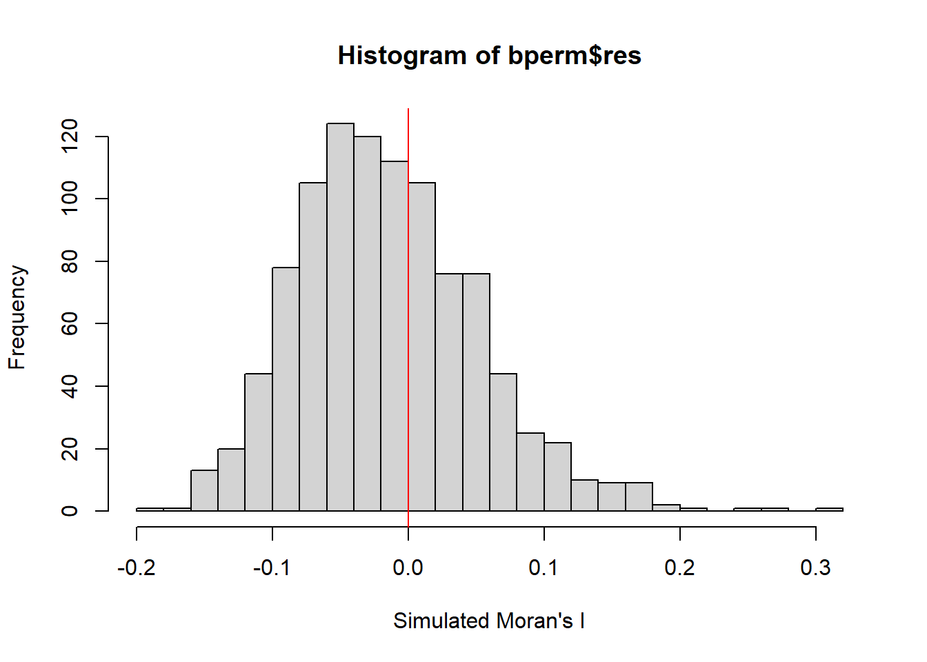
Global Spatial Autocorrelation using Geary’s C test
Geary’s C test describes how features differ from their immediate neighbours. It uses a Geary C(Z value).
- If the Geary C value is larger than 1: the features are dispersed and observations tend to be different.
- If the Geary C value is smaller than 1: the features are clustered and observations tend to be similar.
- If the Geary C value is close to 1: the features are randomly arranged.
Relationship to Moran’s I test
Both tests have an inverse relationship to each other where a low C value and high I value can be seen when there is clustering of similar values. High C value and low I value can be seen when dissimilar values cluster.
C values range from 0 to 3 while I values range from -1 to 1.
Performing the test
Here we use the geary.mc() to perform the Geary C test.
geary.test(hunan$GDPPC, listw=rswm_q)
    Geary C test under randomisation

data:  hunan$GDPPC
weights: rswm_q

Geary C statistic standard deviate = 3.6108, p-value = 0.0001526
alternative hypothesis: Expectation greater than statistic
sample estimates:
Geary C statistic       Expectation          Variance
        0.6907223         1.0000000         0.0073364
We can also perform a permutation test with a simulation.
set.seed(1234)
bperm=geary.mc(hunan$GDPPC,
               listw=rswm_q,
               nsim=999)
bperm
    Monte-Carlo simulation of Geary C

data:  hunan$GDPPC
weights: rswm_q
number of simulations + 1: 1000

statistic = 0.69072, observed rank = 1, p-value = 0.001
alternative hypothesis: greater
Visualising the Geary’s C test
We can then plot the distribution of the simulated Geary’s C statistical test using a histogram.
mean(bperm$res[1:999])[1] 1.004402var(bperm$res[1:999])[1] 0.007436493summary(bperm$res[1:999]) Min. 1st Qu. Median Mean 3rd Qu. Max.
0.7142 0.9502 1.0052 1.0044 1.0595 1.2722 hist(bperm$res, freq=TRUE, breaks=20, xlab="Simulated Geary c")
abline(v=1, col="red") 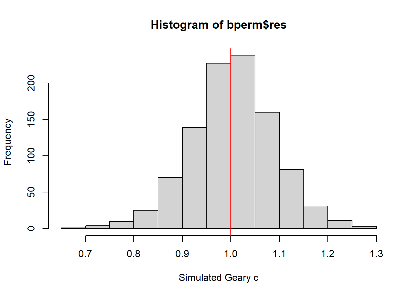
Spatial Correlogram
Here we examine the patterns of the Moran’s I and Geary’s C test. We can see the correlation of when distances are increased.
Moran’s I correlogram
We will use the sp.correlogram() for calculating the spatial correlogram of the devleopment of Hunan.
MI_corr <- sp.correlogram(wm_q,
                          hunan$GDPPC,
                          order=6,
                          method="I",
                          style="W")
plot(MI_corr)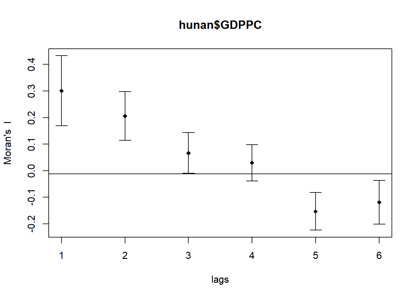
print(MI_corr)Spatial correlogram for hunan$GDPPC
method: Moran's I
estimate expectation variance standard deviate Pr(I) two sided
1 (88) 0.3007500 -0.0114943 0.0043484 4.7351 2.189e-06 ***
2 (88) 0.2060084 -0.0114943 0.0020962 4.7505 2.029e-06 ***
3 (88) 0.0668273 -0.0114943 0.0014602 2.0496 0.040400 *
4 (88) 0.0299470 -0.0114943 0.0011717 1.2107 0.226015
5 (88) -0.1530471 -0.0114943 0.0012440 -4.0134 5.984e-05 ***
6 (88) -0.1187070 -0.0114943 0.0016791 -2.6164 0.008886 **
---
Signif. codes: 0 '***' 0.001 '**' 0.01 '*' 0.05 '.' 0.1 ' ' 1Geary’s C correlogram
We will use the sp.correlogram() for calculating the spatial correlogram of the devleopment of Hunan.
GC_corr <- sp.correlogram(wm_q,
                          hunan$GDPPC,
                          order=6,
                          method="C",
                          style="W")
plot(GC_corr)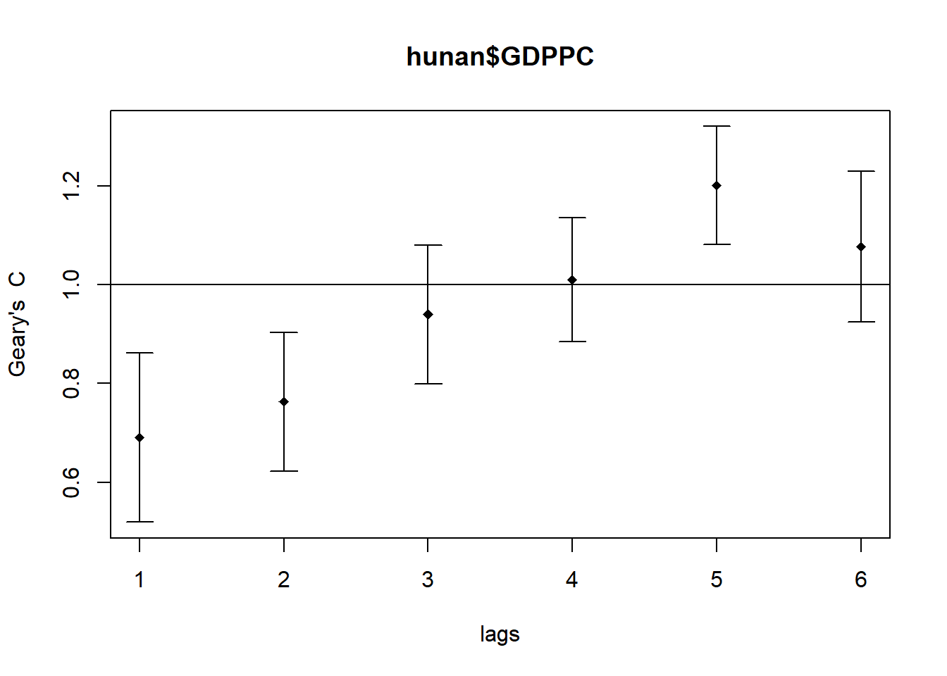
print(GC_corr)Spatial correlogram for hunan$GDPPC
method: Geary's C
estimate expectation variance standard deviate Pr(I) two sided
1 (88) 0.6907223 1.0000000 0.0073364 -3.6108 0.0003052 ***
2 (88) 0.7630197 1.0000000 0.0049126 -3.3811 0.0007220 ***
3 (88) 0.9397299 1.0000000 0.0049005 -0.8610 0.3892612
4 (88) 1.0098462 1.0000000 0.0039631 0.1564 0.8757128
5 (88) 1.2008204 1.0000000 0.0035568 3.3673 0.0007592 ***
6 (88) 1.0773386 1.0000000 0.0058042 1.0151 0.3100407
---
Signif. codes: 0 '***' 0.001 '**' 0.01 '*' 0.05 '.' 0.1 ' ' 1