pacman::p_load(sf, sfdep, tmap, plotly, tidyverse, Kendall)In-class_Ex2_EHSA
Overview
Here we will explore emerging hot spot analysis(EHSA) which represents a the change in hot and cold spots over time if there is any.
The steps needed can be summarised as the following: - Building a space-time cube - Calculate Getis-Ord local Gi* statistic using FDR correction - Use Mann-Kendall trend test to evaluate each hot and cold spot - categorise each region by referring to the z-score and p-value for each area and bin
Loading packages and data
Loading packages
Loading data
Geospatial data
The following uses the st_read() function from the sf package to read the geospatial data.
hunan <- st_read(dsn = "data/geospatial",
                 layer = "Hunan")
Reading layer `Hunan' from data source
`C:\Users\Lian Khye\Desktop\MITB\Geospatial\geartooth\ISSS624\In-class_Ex\Ex2\data\geospatial'
using driver `ESRI Shapefile'
Simple feature collection with 88 features and 7 fields
Geometry type: POLYGON
Dimension: XY
Bounding box: xmin: 108.7831 ymin: 24.6342 xmax: 114.2544 ymax: 30.12812
Geodetic CRS: WGS 84Import attribute table
Here we will import the Hunan_GDPPC csv file.
GDPPC <- read_csv("data/aspatial/Hunan_GDPPC.csv")Creating a time series cube
Here we will be creating the time-series cube using the spacetime() function of the sfdep package.
GDPPC_st <- spacetime(GDPPC, hunan,
                      .loc_col = "County",
                      .time_col = "Year")
Computing Gi*
Derive Spatial Weights
Here we will use the inverse distance weights for identifying neighbours.
GDPPC_nb <- GDPPC_st %>%
  activate("geometry") %>%
  mutate(nb = include_self(st_contiguity(geometry)),
         wt = st_inverse_distance(nb, geometry,
                                  scale = 1,
                                  alpha = 1),
         .before = 1) %>%
  set_nbs("nb") %>%
  set_wts("wt")
We will use activate() function to activate the geometry context and the mutate() to create 2 new columns named nb and wt. We will then use set_nbs() and set_wts() to copy the nb and wt columns.
Gi* calculation
Next we will calculate the local Gi* for each county by grouping the year and using the local_gstar_perm() fucntion and use the unnest() function to unnest the gi_star column of the new gi_stars dataframe.
gi_stars <- GDPPC_nb %>%
  group_by(Year) %>%
  mutate(gi_star = local_gstar_perm(
    GDPPC, nb, wt)) %>%
  tidyr::unnest(gi_star)
Mann-Kendall Test
Here we will be using the Gi* values for calculating the Mann-Kendall test. This test will test for changes but not the magnitude of change.
The following code uses Changsha county.
cbg <- gi_stars %>%
  ungroup() %>%
  filter(County == "Changsha") |>
  select(County, Year, gi_star)
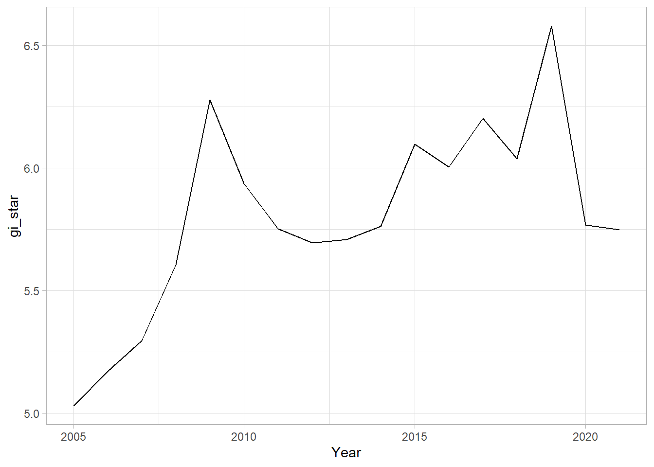
Next we can then plot the change using ggplot package.
ggplot(data = cbg,
       aes(x = Year,
           y = gi_star)) +
  geom_line() +
  theme_light()
Here we can make the graph more interactive.
p <- ggplot(data = cbg,
       aes(x = Year,
           y = gi_star)) +
  geom_line() +
  theme_light()

ggplotly(p)
Finally we can calculate the p-value, signify by the sl column.
cbg %>%
  summarise(mk = list(
    unclass(
      Kendall::MannKendall(gi_star)))) %>%
  tidyr::unnest_wider(mk)
# A tibble: 1 × 5
tau sl S D varS
<dbl> <dbl> <dbl> <dbl> <dbl>
1 0.485 0.00742 66 136. 589.We can apply this to all of the locations using a group_by() function.
ehsa <- gi_stars %>%
  group_by(County) %>%
  summarise(mk = list(
    unclass(
      Kendall::MannKendall(gi_star)))) %>%
  tidyr::unnest_wider(mk)
EHSA
Here we can arrange the EHSA.
emerging <- ehsa %>%
  arrange(sl, abs(tau)) %>%
  slice(1:5)
emerging
# A tibble: 5 × 6
County tau sl S D varS
<chr> <dbl> <dbl> <dbl> <dbl> <dbl>
1 Shuangfeng 0.868 0.00000143 118 136. 589.
2 Xiangtan 0.868 0.00000143 118 136. 589.
3 Xiangxiang 0.868 0.00000143 118 136. 589.
4 Chengbu -0.824 0.00000482 -112 136. 589.
5 Dongan -0.824 0.00000482 -112 136. 589.Emerging hotspot analysis
Finally we will perform EHSA analysis using emerging_hotspot_analysis() function. It takes a spacetime object and the variable of interest as the .var argument. The k argument refers to the time lags specified and the nsim refers to the number of simulation to be performed.
ehsa <- emerging_hotspot_analysis(
  x = GDPPC_st,
  .var = "GDPPC",
  k = 1,
  nsim = 99
)
Visualisation of EHSA classes
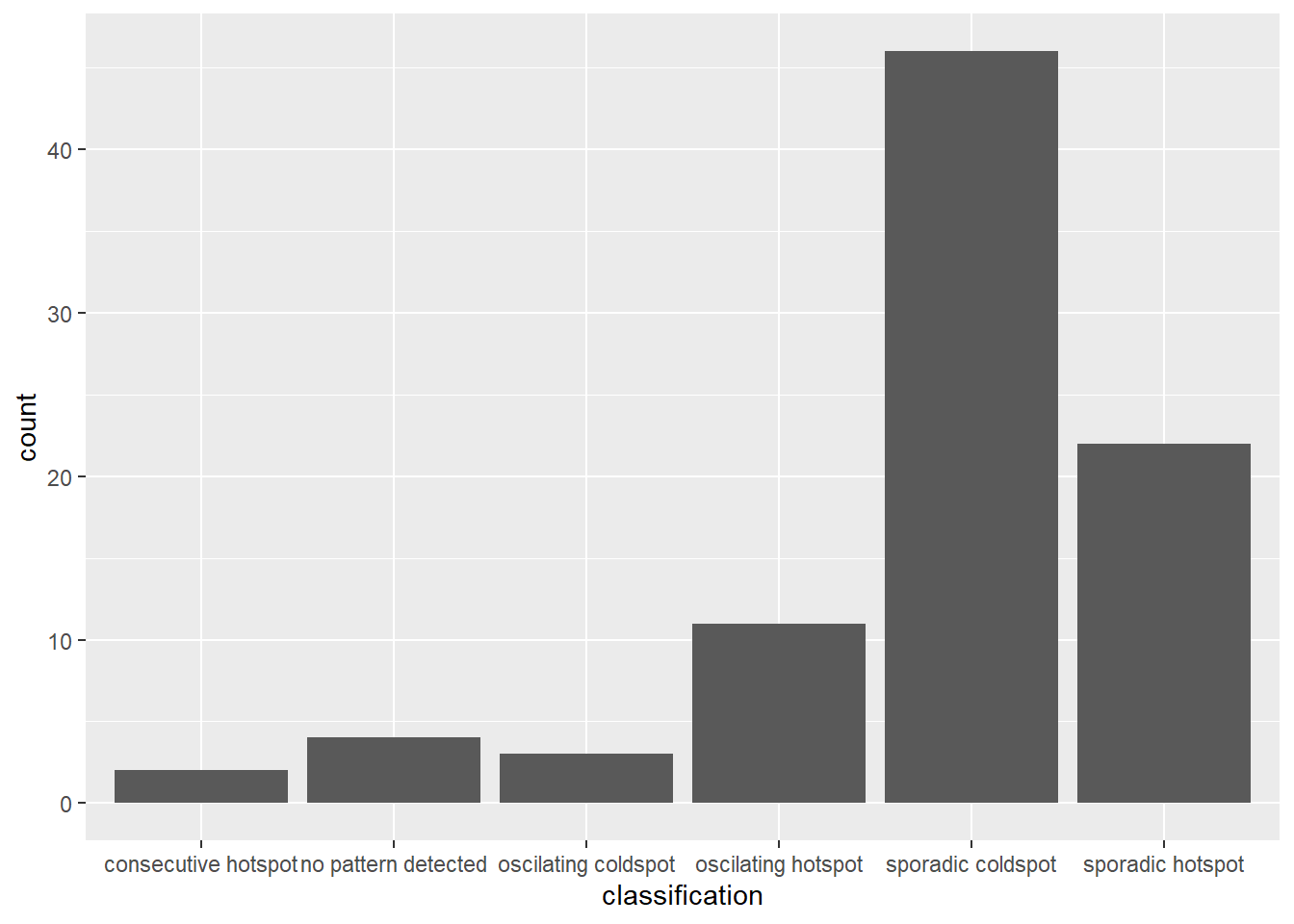
We can the plot the EHSA using a bar chart by using ggplot2 package.
ggplot(data = ehsa,
       aes(x = classification)) +
  geom_bar()
Visualisation of EHSA
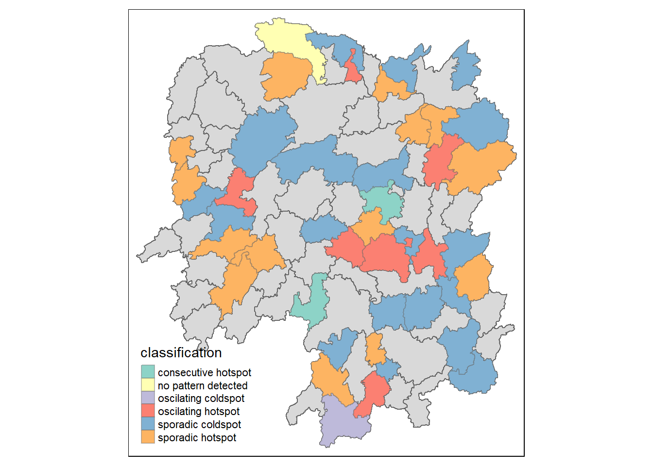
We can also visualise the distribution of EHSA using a choropleth map.
hunan_ehsa <- hunan %>%
  left_join(ehsa,
            by = join_by(County == location))
ehsa_sig <- hunan_ehsa  %>%
  filter(p_value < 0.05)
tmap_mode("plot")
tm_shape(hunan_ehsa) +
  tm_polygons() +
  tm_borders(alpha = 0.5) +
tm_shape(ehsa_sig) +
  tm_fill("classification") +
  tm_borders(alpha = 0.4)